Last month, we compared a long-term market trend to the conveyor belt on an excavator. As long as the stones and dirt remain on the belt, they continue to rise. But when they reach the end of that support, they fall. Not because the machine necessarily failed, but because the support beneath them ended.
The lesson was simple: every long-term rising trend eventually ends. That leaves us with a far more important question:
How might we recognize when a long-term trend is beginning to change?
The answer may have been sitting directly in front of us all along. In the first six articles of this series, we examined more than a century of market history and revisited five of its most consequential declines. We studied what happened before the damage was done, how long recovery took, and why the loss of time can matter as much as the loss of money.
Now those pieces come together. What they reveal is one of the most meaningful historical patterns I have encountered during my thirty-year career.
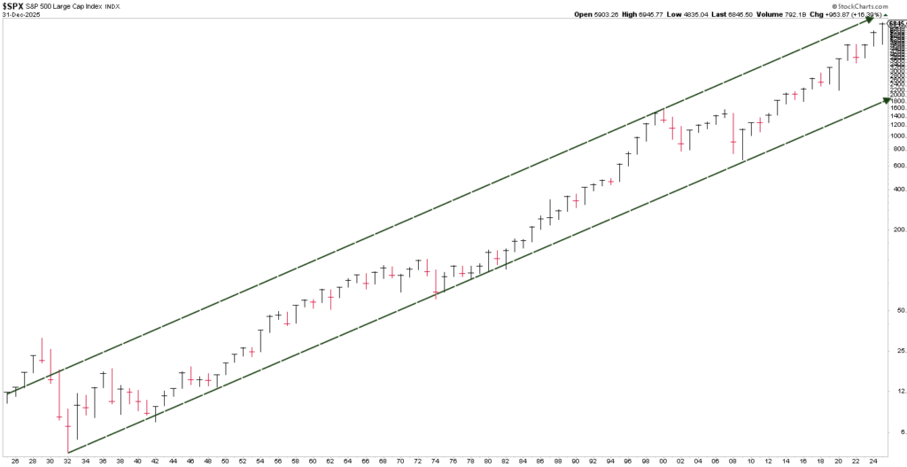
Chart courtesy of StockCharts.com, Data as of 12/31/25
A Century in One Picture
For a quick refresher, the chart above shows approximately 100 years of the S&P 500. Each vertical bar represents one calendar year of price movement from 1925 through 2025. Black bars mark positive years; red bars mark negative years. Across the entire picture, the market remained within the two long-term rising boundaries shown in dark green after the early 1930s.
From a distance, the market appears to have followed one enormous rising channel. But look more closely and another layer becomes visible. Within that century-long rise, the market did not travel upward in one smooth motion. It moved through shorter phases of its own: rising trends, long sideways consolidation periods, and major declines.
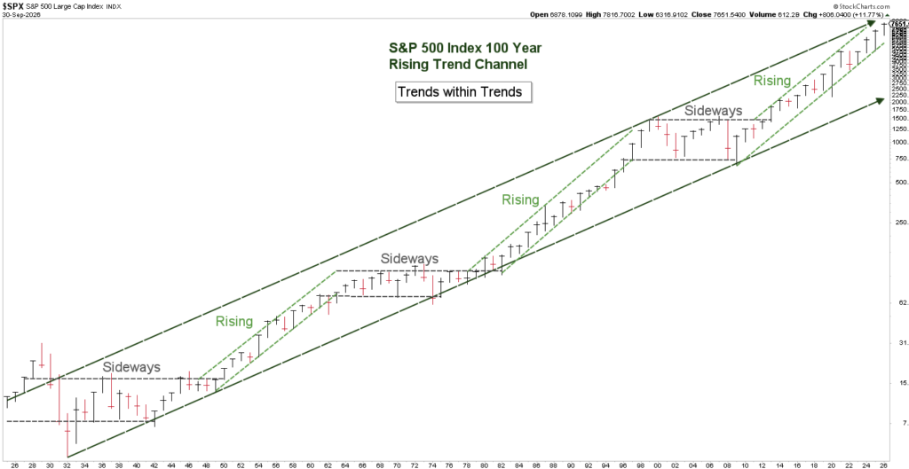
Chart courtesy of StockCharts.com, Data as of 9/30/26
The light green dashed lines identify the rising phases. The horizontal gray dashed lines identify the long sideways consolidating phases. Now let’s add the major declines examined throughout this series.
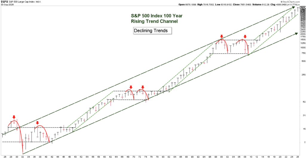
Chart courtesy of StockCharts.com, Data as of 9/30/26
Now Look at Where the Damage Occurred
This is where the picture changes.
Within the historical framework shown here, the five major declines we examined did not begin in the middle of the sustained rising phases. Each occurred during one of the extended sideways consolidation periods. In other words:
The largest losses did not arrive randomly across time. They clustered inside the periods when the long-term rise had stalled!
Pause and consider what that means. For six months, we studied those declines one at a time. Seen separately, each appeared to belong to a different era, with different headlines, different economic conditions, and different generations of investors. Seen together, they reveal a consistent pattern.
The dates changed. The causes were different. But the pattern remained essentially the same.
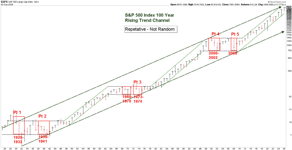
Chart courtesy of StockCharts.com, Data as of 9/30/26
Why This Matters Now
Following the declines examined in Parts 1 and 2, the S&P 500 entered a rising phase that lasted roughly two decades, depending on the starting point used. That advance eventually gave way to a sideways consolidation period, which included the declines discussed in Part 3.
When that period ended, the market began another powerful advance that also lasted approximately two decades. The next sideways consolidation phase included the declines examined in Parts 4 and 5.
Today, the market is in another long-term rising phase. By the end of the year, that phase will be approximately eighteen years old. That does not create a countdown. Two earlier examples do not establish a schedule, and history cannot tell us the exact month or year when the present trend will change. We will rely on the Blue Line to help us identify that future moment in time.
But the comparison raises a question that deserves more than a passing thought:
When the next significant market decline arrives, will it set you back–or will you be prepared for it to set you up for the opportunities that follow?
Your Age Is Important, but It Is Not the Market
Many investment decisions are built primarily around age. As investors grow older, portfolios are often adjusted according to a predetermined formula. Age matters because time horizon, income needs, taxes, and the ability to withstand loss all matter. But such decisions ignore the most important factor of all:
The prevailing trend of the financial markets
The market does not know when you plan to retire. It does not adjust because you have reached a certain birthday. And it does not reduce a loss simply because you have less time to recover from it.
That is why we believe market conditions deserve a place in the decision-making process. A person approaching retirement may still need their money to participate when the evidence supports a rising trend. That same person may also need their strategy to auto-adapt when the evidence begins to change.
The goal is not to predict every market movement. It is to avoid treating clearly different market environments as though they were all the same.
History Is a Warning–Not a Promise
No chart can guarantee what comes next. Historical patterns can fail, signals can arrive late, and any investment process can be wrong on occasion. But uncertainty is not a reason to ignore evidence. It is a reason to define in advance what evidence would cause us to reconsider our position.
A principal from Scripture expresses the idea well:
11 And all these things happened to them as examples; and it is written for our warning…. 12 So let him who thinks he stands take heed lest he fall.”
1 Corinthians 10:11-12
The market’s history cannot spare us from every future decline. It can, however, show us what complacency has cost previous generations–and remind us to pay attention before confidence turns into vulnerability.
Preparation does not require fear. It requires awareness, evidence, and a willingness to adapt when conditions change.
In the next and final article of this series, we will take the last step. We will move beyond recognizing the end of the conveyor belt and examine the concept behind how the strategy seeks to adapt when the market begins changing directions.
The summit is not only where the journey ends. Properly recognized, it may also reveal where the next opportunity begins.
Where We Stand as of Month’s End
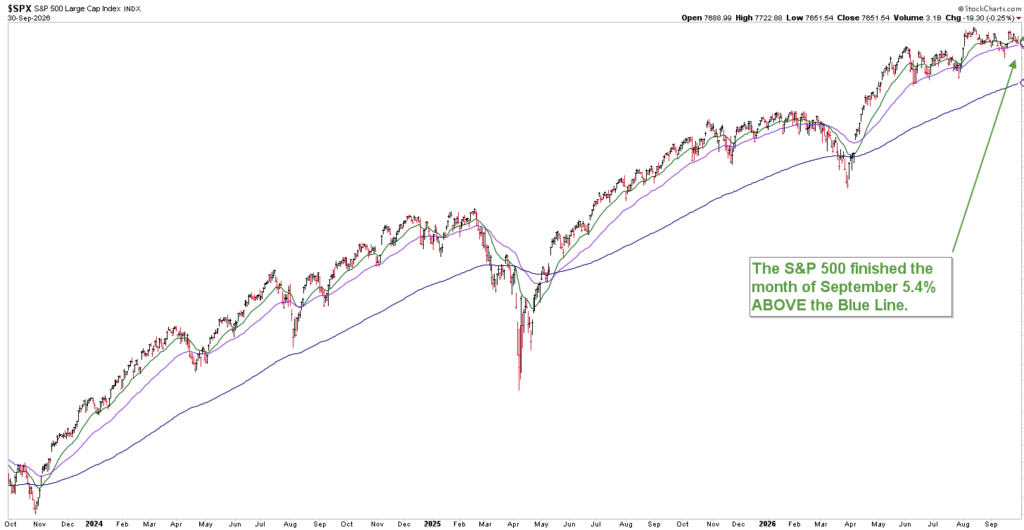
Chart courtesy of StockCharts.com, Data as of 9/30/26
As of the end of September:
- The S&P 500 finished the month 5.4% above the Blue Line
- One month earlier, it stood 7.4% above the Blue Line
Markets will always fluctuate. Headlines will always compete for your attention. Our responsibility is to look beyond the emotion, study the evidence, and make disciplined investment decisions according to a process.
To our clients, thank you for trusting us to be your advocate. If you’re not yet a client, we’d welcome the opportunity to show you how our disciplined investment process seeks to help investors participate in long-term market growth while working to protect against life-changing losses.
Participate. Protect. Prosper.
Jeff Link
Founder
(833) 258-2583
Disclaimers:
The BLUE LINE INVESTING® (BLI) investment process was founded on over 95 years of stock market history. It seeks to identify and align investment decisions with multiyear trends. Various aspects of this process have been illustrated in my book Protecting The Pig: How Stock Market Trends Reveal the Way to Grow and Preserve Your Wealth.
The S&P 500 Index is one of the most commonly followed equity indices, and many consider it one of the best representations of the U.S. stock market, and a bellwether for the U.S. economy. It is comprised of 500 large companies having common stock listed on the NYSE or NASDAQ. The volatility (beta) of the account may be greater or less than the index. It is not possible to invest directly in this index.
Technical analysis is a method of evaluating securities by analyzing statistics generated by market activity, such as past prices and volumes. Technical analysis attempts to predict a future stock price or direction based on market trends. The assumption is that the market follows discernible patterns and if these patterns can be identified then a prediction can be made. The risk is that markets may not always follow patterns. There are certain limitations to technical analysis research, such as the calculation results being impacted by changes in security price during periods of market volatility. Technical analysis is one of many indicators that may be used to analyze market data for investing purposes and should not be considered a guaranteed prediction of market activity. The opinions expressed are those of BLI. The opinions referenced are as of the date of publication and are subject to change without notice. BLI reserves the right to modify its current investment strategies based on changing market dynamics or client needs.
Past performance is not indicative of future results. This material is not financial advice or an offer to sell any product. The information contained herein should not be considered a recommendation to purchase or sell any particular security. Forward-looking statements cannot be guaranteed.
Investment advisory services offered through Guardian Wealth Advisors, LLC D/B/A Blue Line Investing. Guardian Wealth Advisors, LLC (“GWA”) is an investment adviser registered with the U.S. Securities and Exchange Commission. Registration does not imply a certain level of skill or training. More information about GWA’s investment advisory services can be found in its Form CRS or Form ADV Part 2, which is available upon request.
GWA-26-80